Why maps are lying to you (Greenland is NOT that big)
The Truth Behind the Giant Island Trick
By Peter Teoh, Science Writer
 Greenland looks huge on most world maps, but it’s actually much smaller than it seems. This comparison shows the true size of Greenland versus other countries.
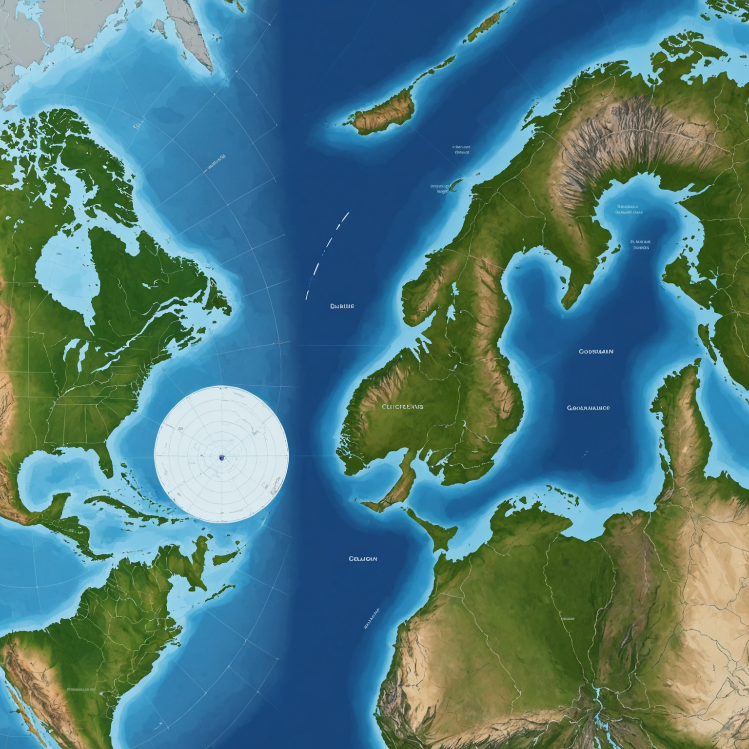
Imagine looking at a world map and seeing Greenland as this enormous chunk of land, almost as big as Africa. It’s hard to miss because it literally takes up a huge space near the top. But here’s the twist: Greenland isn’t really that big. So, why does it look so huge on most maps? Let’s dive into the fascinating story of map projections and how they can trick your eyes.
What’s Going On With Maps?
Most of the world maps you see use something called the Mercator projection. This method was invented way back in 1569 to help sailors navigate the oceans, and it works great for directions. But it comes with a big drawback: it distorts the size of landmasses, especially near the poles (the top and bottom of the Earth).
Because Greenland sits close to the North Pole, the Mercator projection stretches it out to appear gigantic—much bigger than it really is. In reality, Greenland’s area is about 2.16 million square kilometers, which is huge but nothing close to what the map suggests.
How Big is Greenland, Really?
Let’s put it in perspective:
- Greenland is roughly the size of the Democratic Republic of Congo.
- It could fit 1.4 times inside India.
- It is about 4.2 times smaller than the United States.
- Australia could fit inside Greenland 3.5 times.
So, Greenland is big, but not the giant landmass the maps make you think it is[1][3].
Why Do Maps Distort Sizes?
The Earth is a sphere, but maps are flat. Imagine trying to flatten an orange peel without ripping or stretching it—that’s basically what mapmakers have to deal with. Different map projections solve this problem in different ways, but none are perfect.
The Mercator projection preserves shapes and directions but stretches areas near the poles. This is why countries like Greenland and Antarctica appear huge, while those near the equator, like Africa, look relatively smaller.
The Cool Tool to See the Truth
If you want to see how big countries really are, check out The True Size Of website. It lets you drag and drop countries anywhere on the map to compare their actual sizes. When you move Greenland to the equator, it shrinks in size compared to other countries!
Why Does This Matter?
Understanding how maps distort our view of the world helps us realize that appearances can be deceiving. It’s important for geography, education, and even politics because size influences how we think about countries and continents.
Maps are powerful tools, but they come with quirks. So next time you look at a world map, remember: Greenland isn’t as enormous as it looks!
Side Notes
- Mercator Projection: A map style that shows true direction but distorts size.
- Equator: The imaginary line around the middle of the Earth that divides it into northern and southern hemispheres.
- Spherical Earth vs Flat Map: The challenge of representing a 3D curved surface on a 2D plane.
Trending Sidebar
- Why Antarctica Looks So Big: Same distortion effect as Greenland, because it’s near the South Pole.
- Fun Geography Apps: Besides The True Size Of, apps like Google Earth let you explore real sizes and shapes of places worldwide.
- History of Map Projections: From Mercator to Gall-Peters, different projections serve different purposes.
Leave a comment